
Under an active NDA. Everything shown here is abstracted.
One system for a national fraud program
1,500 users across five jurisdictions, doing the same work in spreadsheets, homegrown systems, and off-the-shelf tools that didn’t talk to each other. All while repeating that documentation into a national tool with rigidity and transparency issues.
Client
Centers for Medicare & Medicaid Services (CMS) – Center for Program Integrity
Company
Tista Science & Technology Corporation
Year
2021 – 2024
Role
UX Design Consultant, Senior UX/UI Designer
Tools
Mural, Sketch, Zeplin, Confluence, Jira, Microsoft Suite, Agile/SAFe
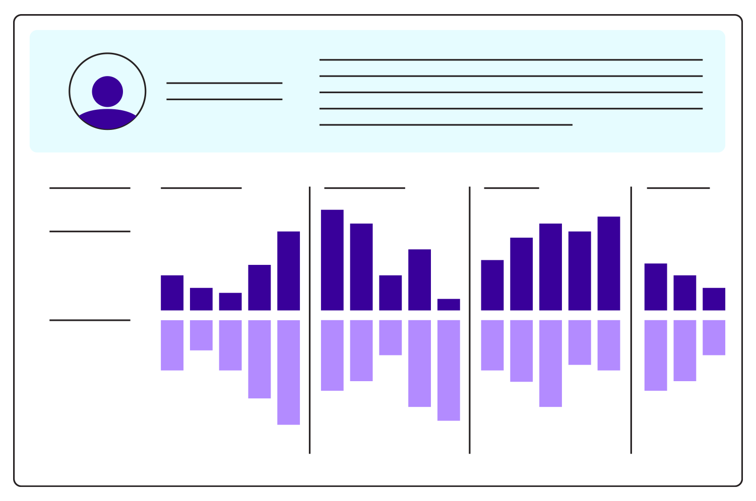
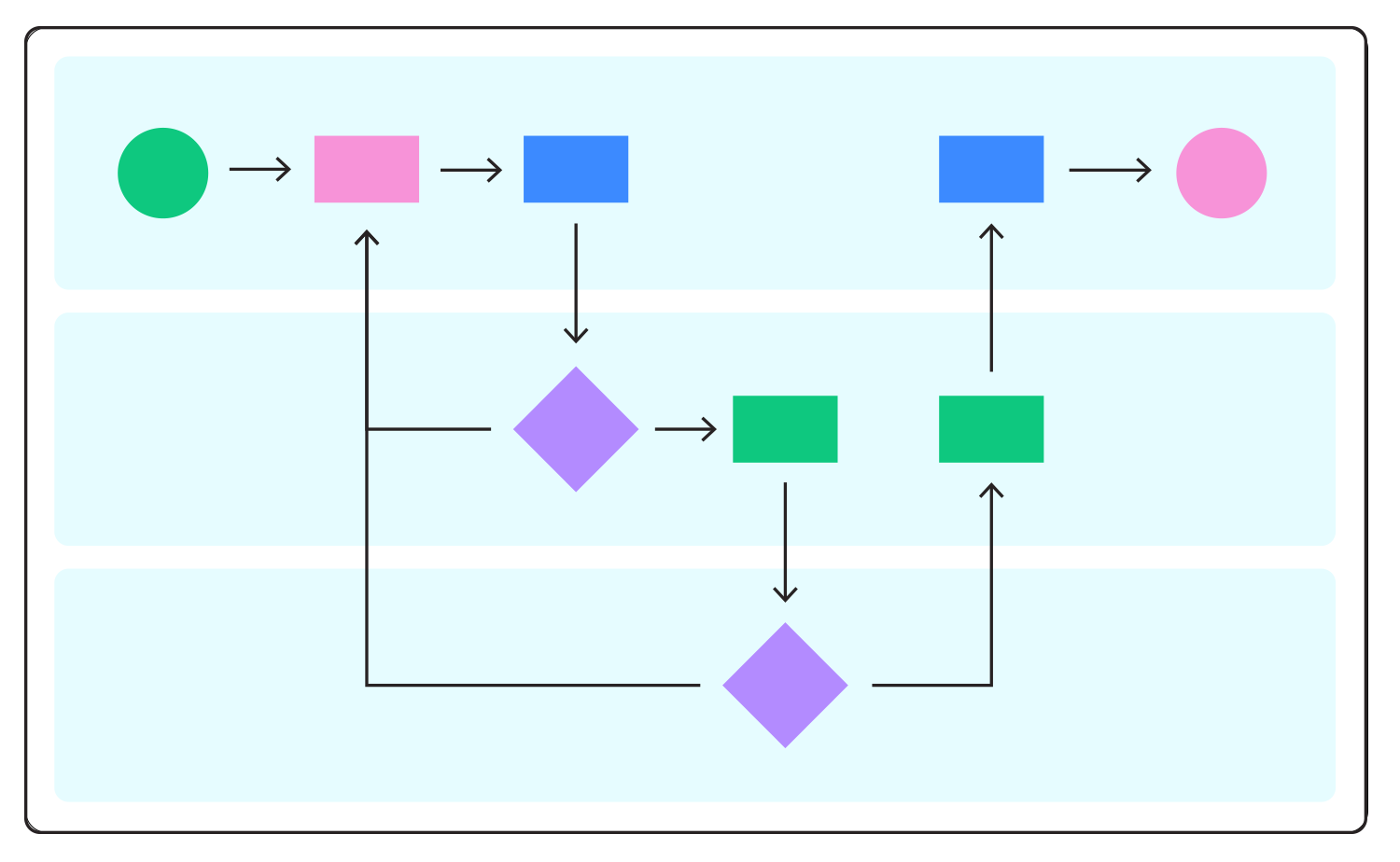
THE GOALUCM has to become the source of truth—and a system people could actually work in.
Replace contractor-specific tools with one place to track leads and investigations across jurisdictions
Reduce what an investigator has to hold in their head to make a defensible decision
Make role and jurisdiction legible in the interface, because access is a legal boundary
Meet Section 508 as a delivery requirement, not a correction later
Turn Center for Program Integrity policy into something a person can follow while doing a task
PROCESSUnified Program Integrity Contractors (UPICs) investigate Medicare and Medicaid fraud. Each jurisdiction had its own commercial software, homegrown applications and spreadsheets, and its own way of working.
That's a usability problem and a much bigger program problem—if CMS and the UPICs can't see their work in one place, it can't answer what's in progress, what's pending, what's been referred, or where something is stuck.
PROBLEM
I planned and led research for five of the six modules I worked on, with six direct contractor groups and CMS stakeholders.
I was after more than the documented process. Which steps were required by policy, and which existed because that's how the old tool worked?
A requirements document tells you what the system is supposed to do. Watching someone work shows you everything they've invented around it.
RESEARCH
The research gave us a way to separate the actual user and business problems from individual requests for features or screens.
Baseline research, user interviews, and business-rule alignment showed where the friction was and what would have the most impact. I mapped new task flows, identified handoffs between roles, and looked for manual steps automation could take without removing the human decision behind it.
EVIDENCE
Organize around the case, not the department. The experience follows the work rather than mirroring the organization flow behind it.
Make jurisdiction and activity log visible, not background. Both touch nearly every screen, so I designed them rather than leaving them to configuration.
Settle the hard questions in wireframes. Hierarchy, module progression and role handoffs are cheap to change before anyone invests in the interface.
Document enough for someone else to build it. User stories, functional requirements and specifications, written so business analysts and engineering could follow the reasoning.
DECISION
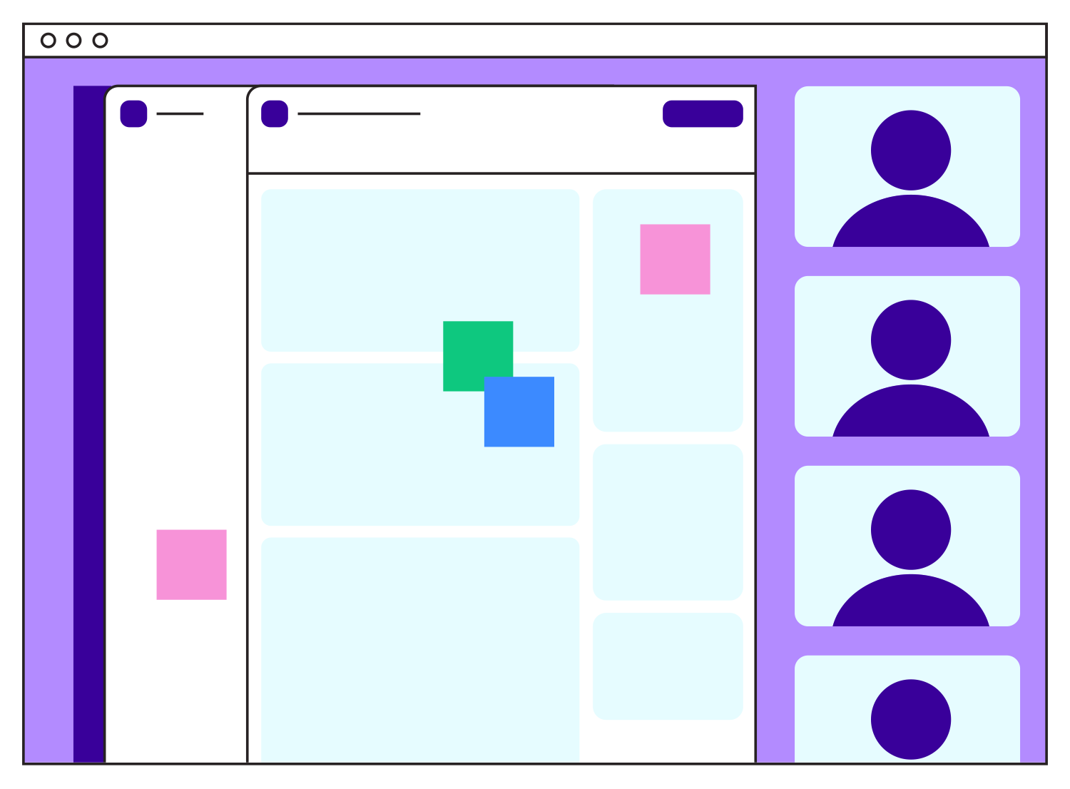
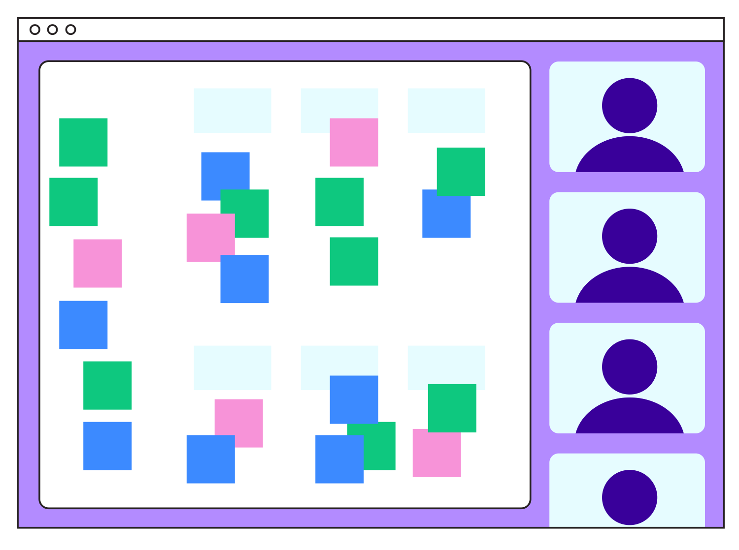
I facilitated more than 20 end-to-end usability sessions across the modules, iterating from low to high fidelity in the design system rather than presenting finished screens for approval.
I worked alongside product owners, business analysts, developers, QA, and the contractor user groups throughout. That kind of collaboration mattered because there was very little room for a concept to make sense in the design stage but fall apart once it met the actual business rules.
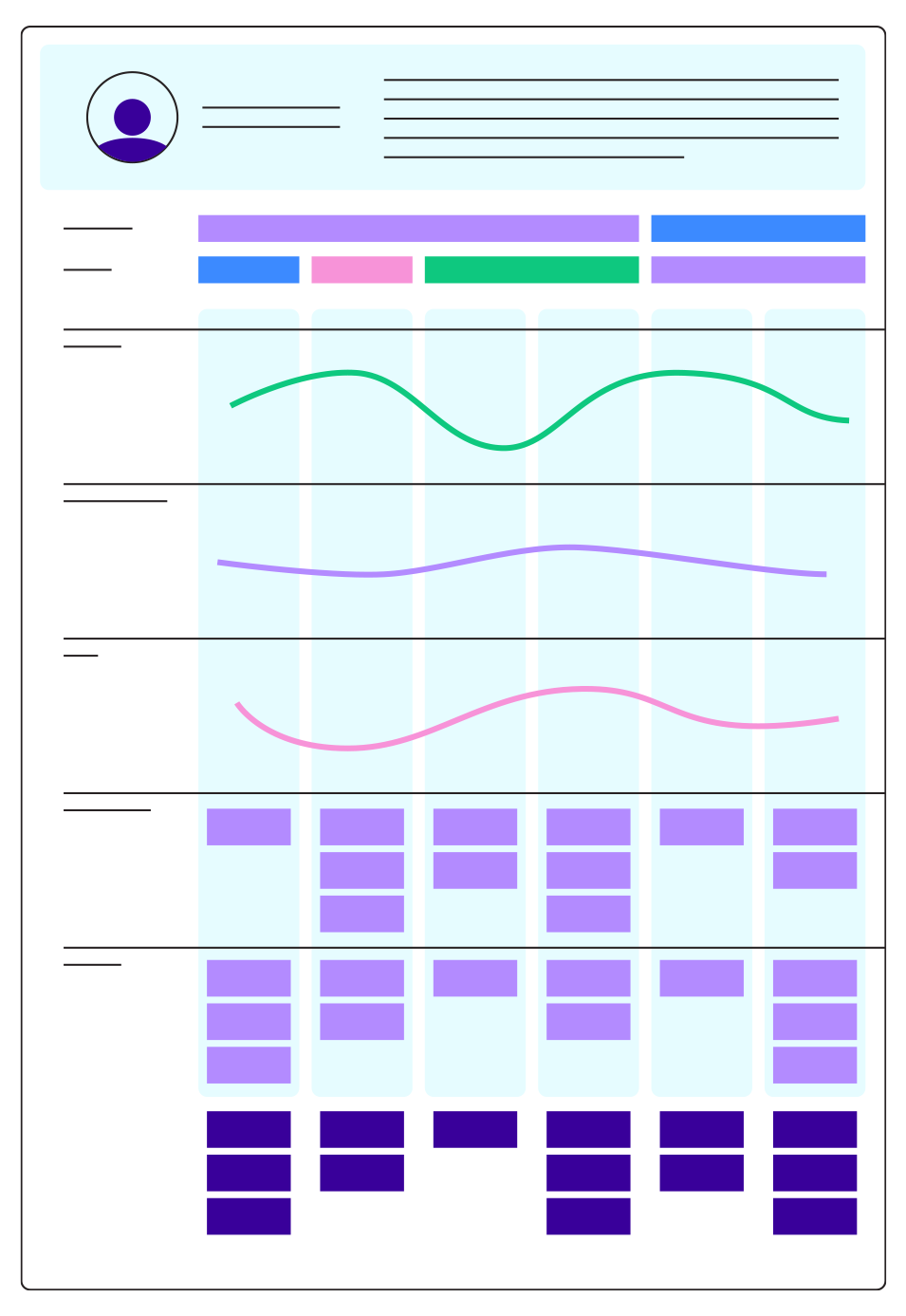
Six journey maps came out of it, and became the client's prioritization tool rather than a research artifact.
VALIDATION
OUTCOME
More than 84% of users reported being satisfied or very satisfied with the redesigned workflows.
Satisfaction figure published by TISTA; program details documented publicly by CMS.
The standalone Fraud Investigation Database and Workflow Management Systems were decommissioned into one CMS-managed environment. New workflows became possible, including real-time Major Case Coordination (MCC) and a single path to initiate, track and close Medical Record Reviews (MRR). Accessibility shipped within the product as a requirement.
Across the program the UX team designed and user-tested more than 1,700 high-fidelity screens. That number is about the nature of the problem, not only its size—there wasn't one complicated workflow, there were hundreds of decisions, exceptions, roles, gates and handoffs that had to become usable every day.
What I droveSix major modules, research through implementation—that served both Medicare and Medicaid programs.
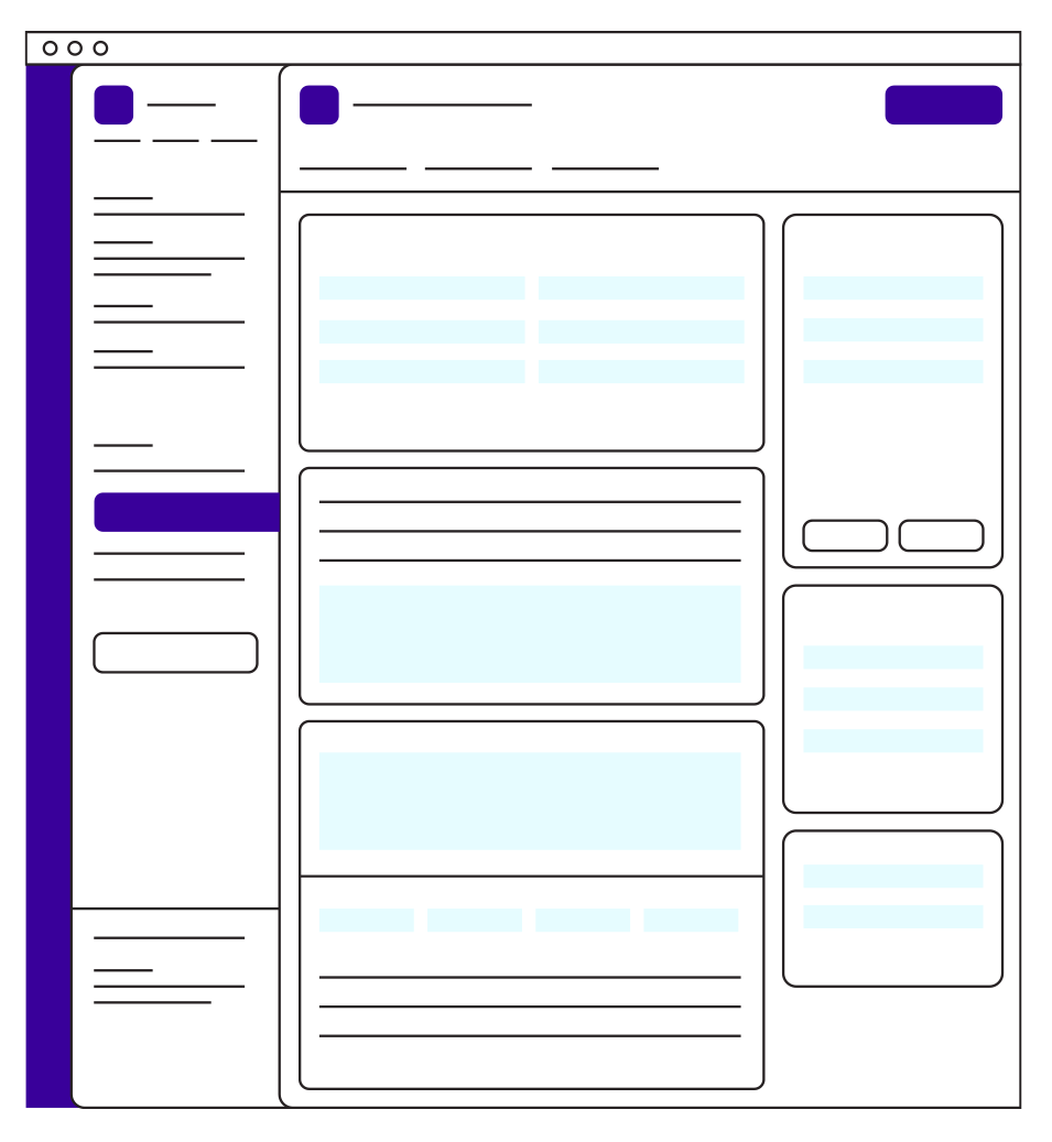
Lead intake, lead vetting, investigation with activity log, and two separate administrative-action modules.
I interviewed and observed CMS users, contractors and business stakeholders, then translated what I learned into journey maps, workflow diagrams, design-system patterns, high-fidelity designs and implementation documentation. I led design and requirements sessions with product owners, business analysts, developers and user groups.
I participated in a full audit of an inherited design system that had drifted, and helped rebuild it into scalable libraries that kept five designers working from the same patterns—the same problem as the program itself, one scale down.
Along the way I learned the Medicaid program properly. In a system like this, understanding the policy isn't separate from understanding the UX: you can't simplify a workflow until you know which complexity is accidental and which is there for a reason.
WHAT PEOPLE SAID“The client is not easily impressed, but when they knew Nicole had been assigned to a particularly difficult task, their anxiety and fears went away.”
Phaedon Hain, Human Centered Design Lead, TISTA Science & Technology