
Get to One
Three health systems merged into one organization. Their three websites didn’t.
Client
Corewell Health
Company
Augusto Digital
Year
September 2024 – March 2025
Role
UX Design Lead
Tools
Figma, ContentStack, analytics, SEO data
THE GOALA patient shouldn’t have to understand how a hospital system is organized in order to find care.
Let people browse services and see what's available near them without learning the org chart
Expose regional differences where they matter to a patient, and hide them where they don't
Reconcile three separate taxonomies into one vocabulary
Preserve search visibility and accessibility through a migration happening in public
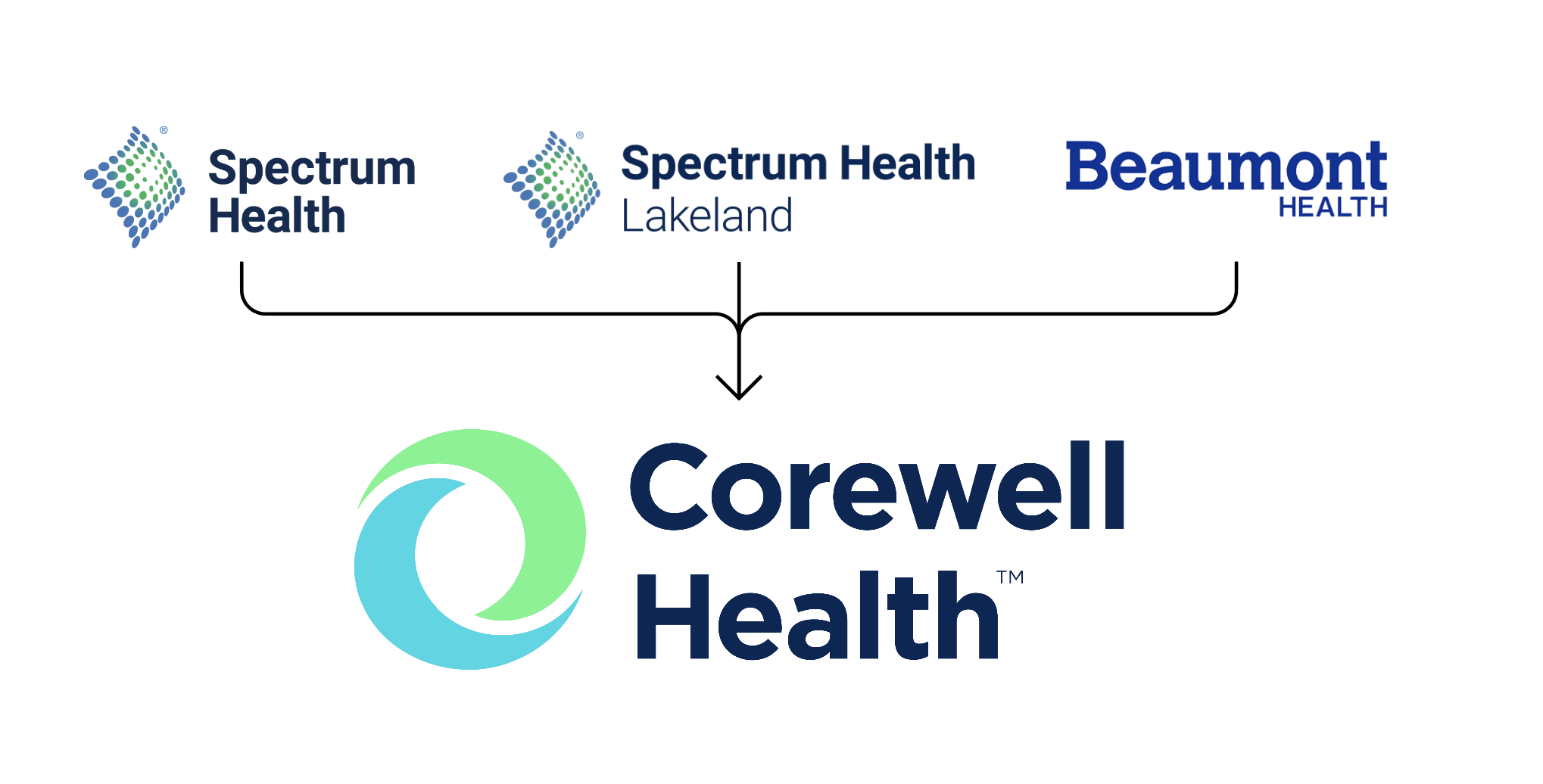
PROCESSBeaumont, Lakeland and Spectrum Health systems had become Corewell Health on paper. Online they were still three organizations.
How fragmented? There was no single phone number for Corewell, which made a page as ordinary as Contact Us genuinely hard to write.
The content carried all of it. Services were named differently in each region, organized differently, and in some cases available in one region and not another. A patient looking for cancer care hit the wall of a corporate merger instead of an answer.
PROBLEM
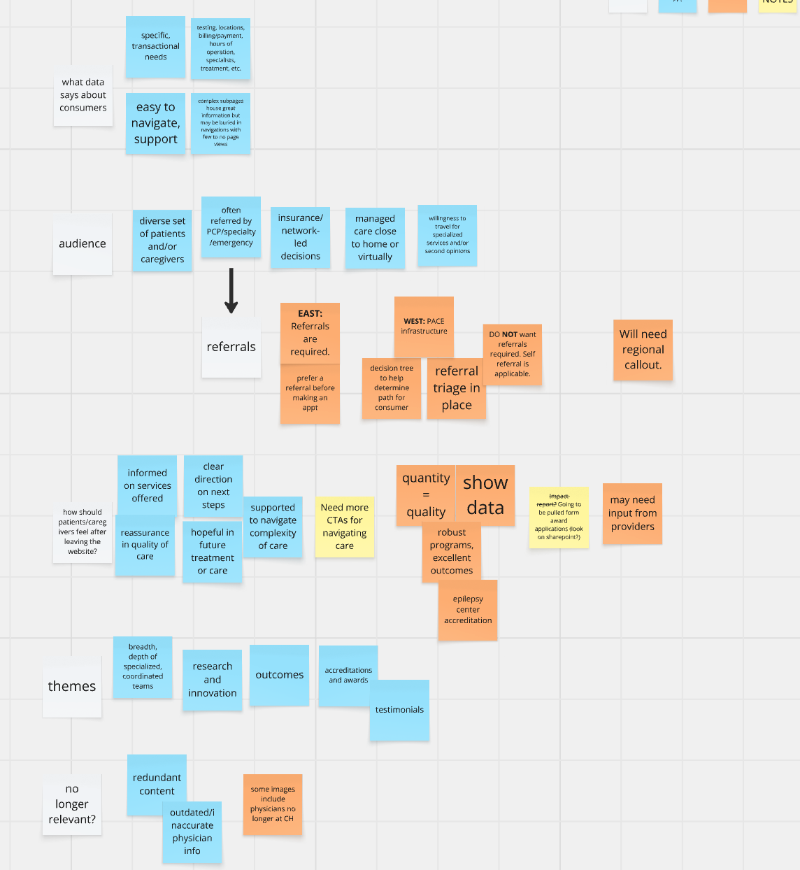
I analyzed more than 100 questionnaire responses from across the three regions, looking for patient needs, the service differences that were real rather than historical, and what each service line uniquely offered.
We ran 30 interview workshops with stakeholders including clinicians and caregivers, mapping user journeys and service flows region by region.
Running underneath both: URL mapping across 35 service lines, monitoring search discoverability and working with marketing leads to verify the data before it informed any structural decision.
RESEARCH
The search data and the site structure disagreed almost everywhere.
People searched by condition and symptom. The sites were organized by department and by which legacy organization owned the page. Three versions of the same service, written three times, competing with each other in search results.
The sharpest finding came out of Women's Health. 58.6% of its high-traffic pages were pregnancy related—preconception, maternity care, postpartum support—but the content was structured as though pregnancy were one topic among many, with no cross-linking between the pages people were actually landing on. Demand was concentrated in a way that the navigation gave no sign of.
Wellness and Lifestyle had the same shape: genuine demand, real content, scattered across three regional websites so that nobody could assemble it into a path.
In both cases the problem wasn't missing content. It was content that couldn't find its own audience.
EVIDENCE
Cancer Resources
Organize around what people are looking for, not who owns it. I structured service lines by how patients search and decide, and surfaced regional availability as information rather than as navigation.
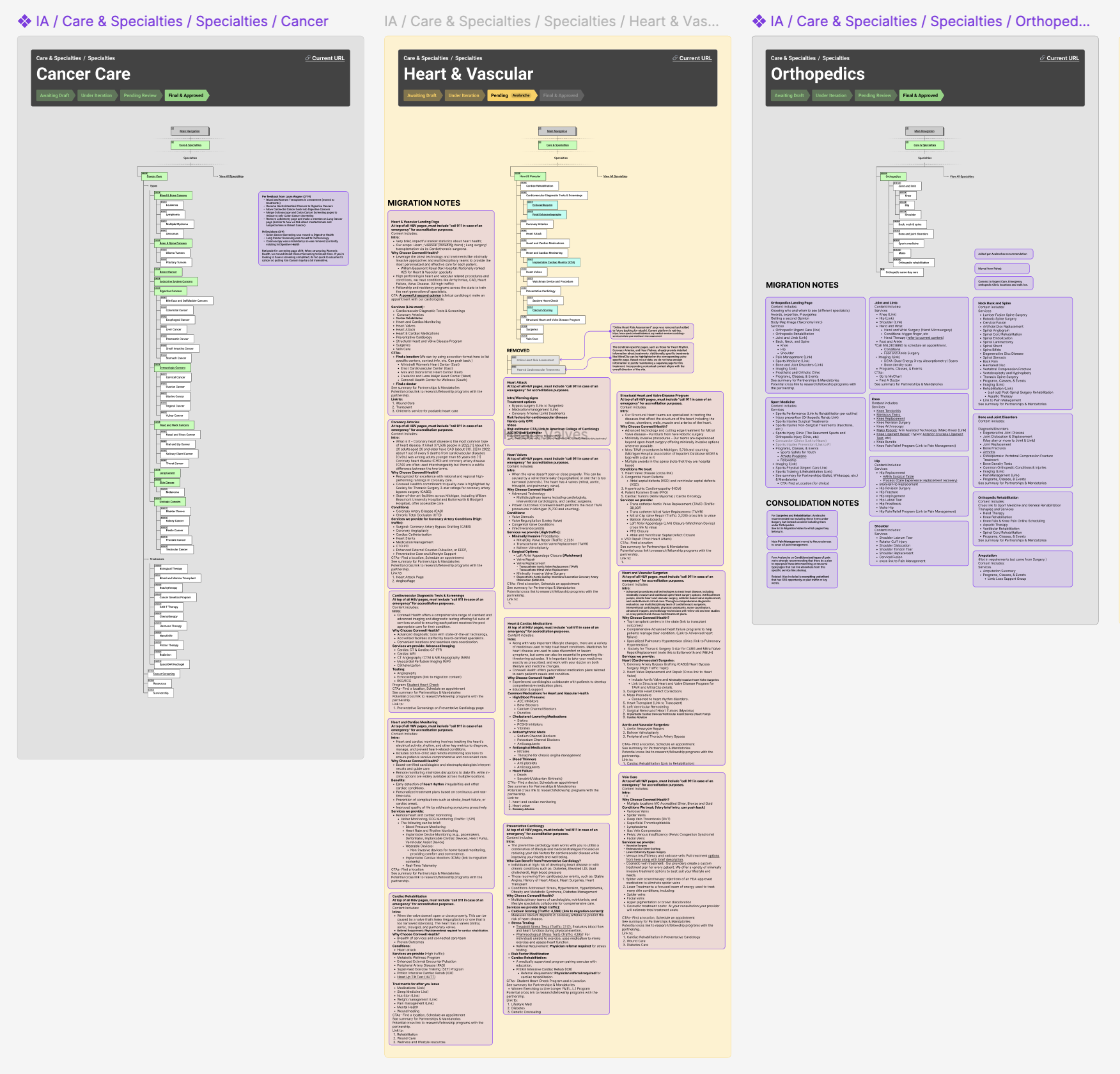
Consolidate rather than migrate. I built data-driven outlines from analytics and SEO so we had a shared, defensible filter for what survived. That turned "whose page gets cut" from a political argument into a criteria-based one which meant I wasn’t the one deciding. The evidence was.
Build components, not pages. Ten reusable responsive components and a page template strategy, so the remaining 1,500 pages could be assembled consistently rather than designed one at a time.
Make content and layout one process. Content blocking—outline, layout, review, iterate—run jointly between UX and content rather than handed across.
DECISION
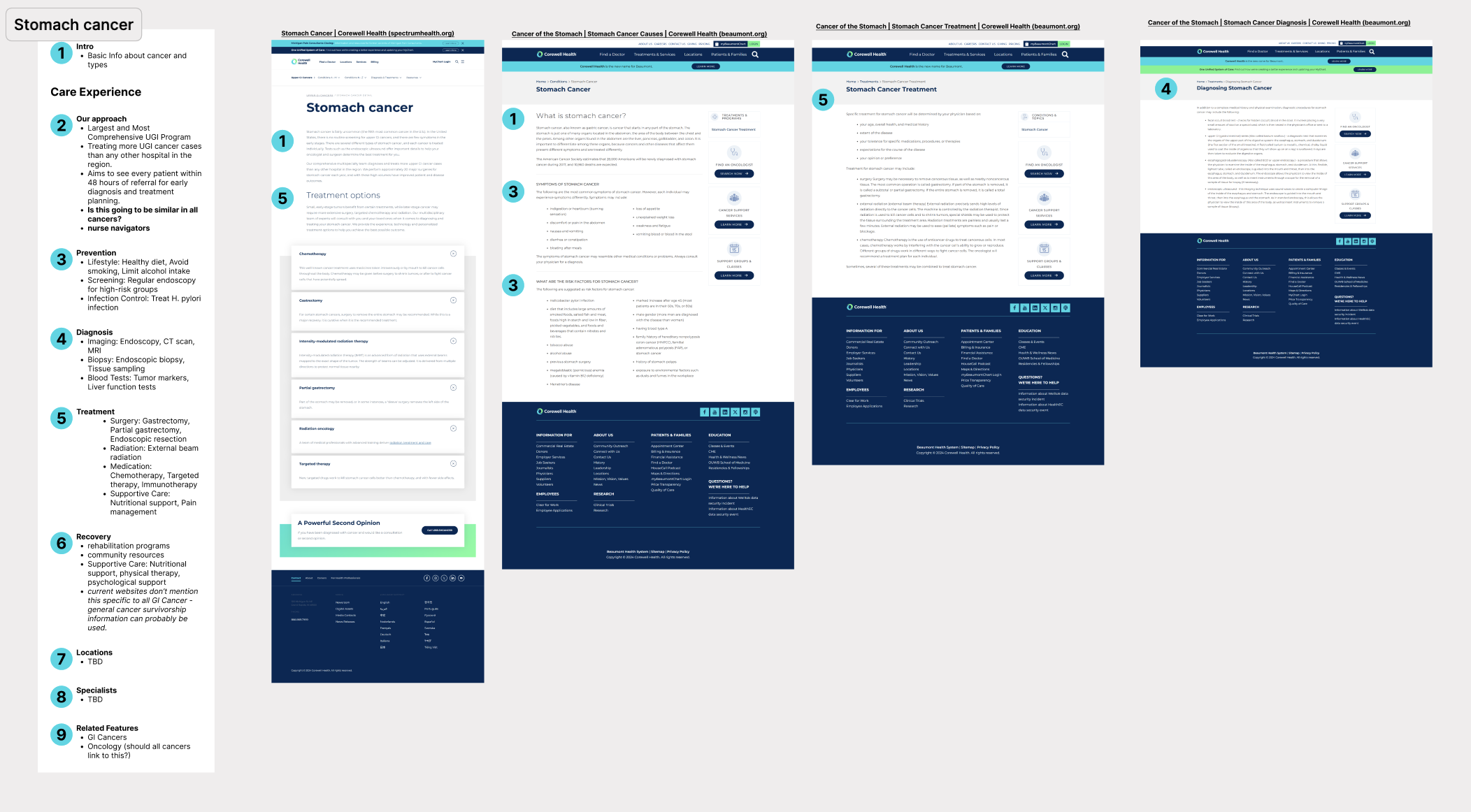
I wireframed service line landing pages and 30+ pages total in low and mid fidelity, reviewed them with the team, then took them to Corewell’s marketing teams and service line leaders. Those are the clinicians and owners whose approval the content needed, which made validation here as much about earning trust as testing structure.
I audited final content with SEO, and let keyword performance inform IA structure and redirects so the migration didn’t cost the organization its search presence.
VALIDATION
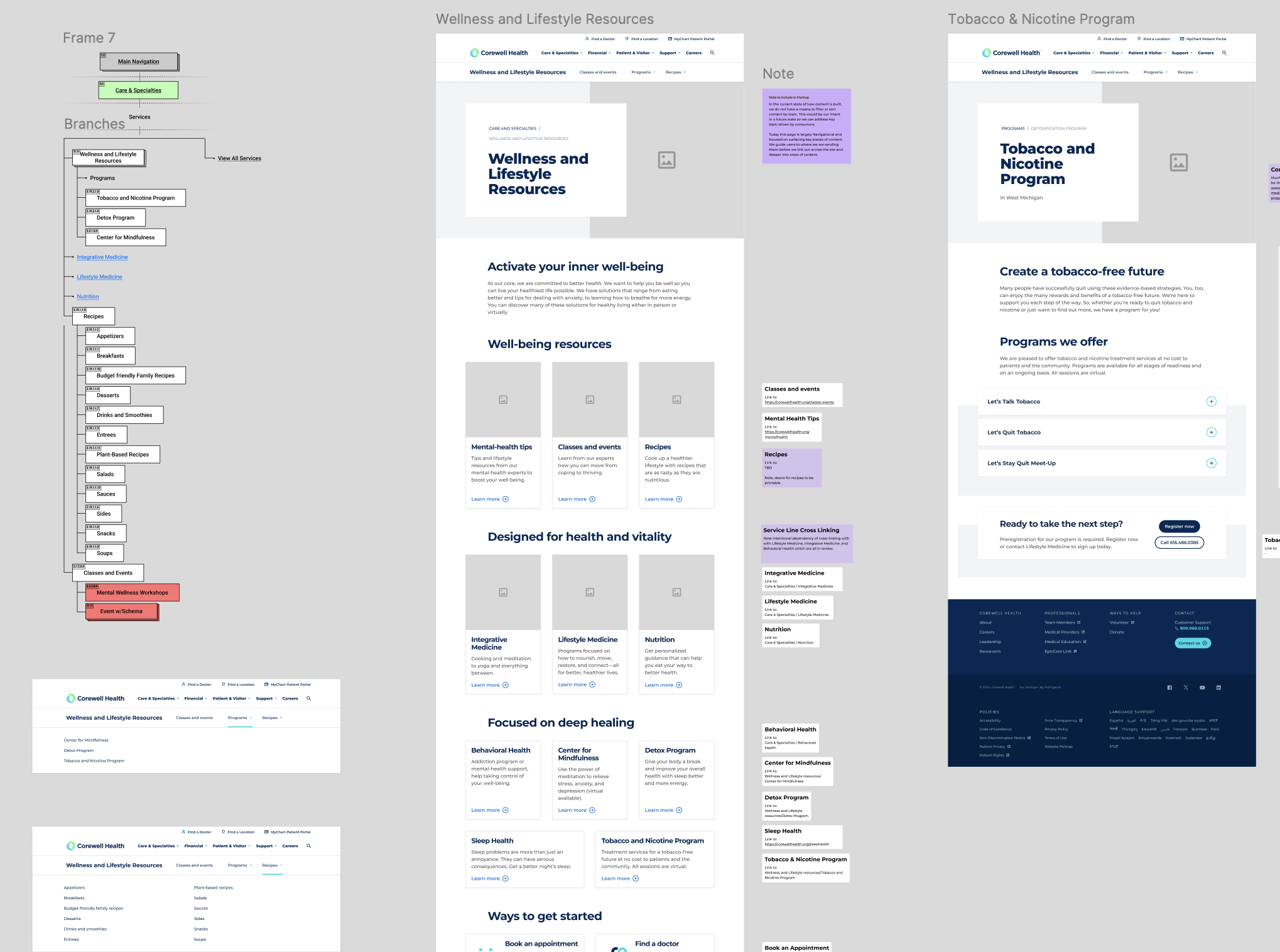
More than 14,000 fragmented pages became roughly 1,500 structured ones, across 14 core service lines and 30+ departments, with one navigation model and one vocabulary in place of three.
The concentrated demand the research found got somewhere to live. Scattered content became dedicated resource hubs—Cancer, Pregnancy, and Wellness & Lifestyle—cross-linked across 10+ core service lines, so a page someone landed on became a place they could act from rather than a dead end.
I handed the work off in March 2025 as the structure moved into build.
OUTCOME
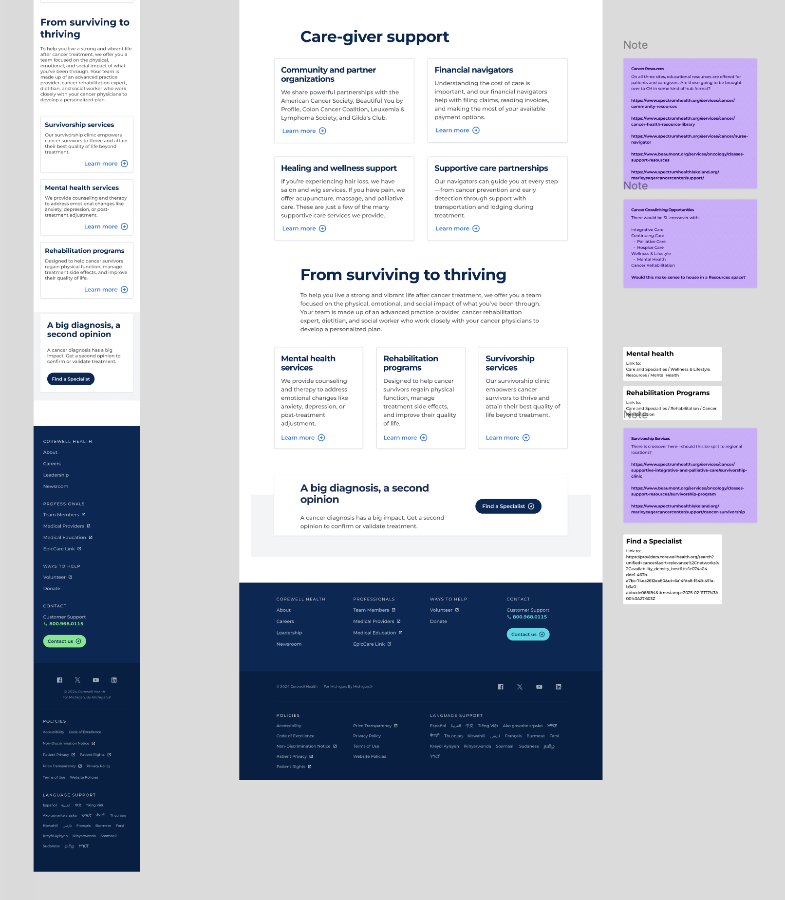
What I droveCancer Care, end-to-end — research, IA framework, content outline, wireframes, stakeholder reviews, handoff.
I joined in September 2024, after the engagement's opening workshop had set a high-level IA and roadmap. My job was to carry that roadmap into the actual content.
I worked in various capacities across 31 service line and program areas—from Primary Care, Emergency and Imaging to Behavioral Health, Genetics, Sleep and Continuing Care.
I ran Cancer Care end-to-end: research, IA framework, content outline, wireframes, stakeholder reviews and handoff. Cancer Care is where this problem is hardest. The most sub-specialties, the most regional variation, and patients making the decision under the most stress.
I also iterated and finalized the IA frameworks and content blocking that other service lines worked from, analyzed traffic and search data to decide what was worth keeping, and designed the page templates the wider migration was assembled with.